Ritte 'Player One' Ace
In this personal project inspired by a decade of unique Ritte unicorns, I created a custom paint design to celebrate its anniversary. Supported by Spencer Canon & Elijah Grundel @ Ritte Racing and Andy van Bergen & David Rome @ CyclingTips.
Head over to CyclingTips here to read the accompanying article or read it below.
Introduction
About five years ago I found an interest in bicycles. My interest was driven by a desire to own a bicycle that was unique. As it turns out, this in itself is not at all unique in our community. For example, you see all these bikes in Melbourne. You can barely find the exact same bike twice. All these bikes you see where people did their own thing, their own little design project. Exchanging parts, stickering the frame, painting the fork. Each and every person I’ve met in our community has a story behind their bike. And why it’s unique to them. For example, the bikes from my fellow VeloClub friends I had the pleasure of meeting and riding along during last year’s Summit in Thailand: John’s Prova, Joel’s Firefly and Caley’s Mosaic. You can make something of your own. Fast forward five years to now, this is what I did.
Irreverence
Back in 2015 during some late night browsing on the internet I came across an article published on the WIRED site titled: “Amazing Ritte Van Vlaanderen Bikes Born From Irreverence”. Captivated by the backstory created by Spencer Canon based on Belgian cyclist Henri “Ritte” Vanlerberghe, as well as the Belgian inspired looks of the Ritte Bosberg, that all too familiar feeling had settled: The heart had decided, the brain had yet to succumb. And the road to succumb was to look at the same photos and read the same texts over a long enough period to realise that any new online searches didn’t result in anything that could possibly be better. Despite some stiff competition from Bianchi wooing me with their stunning traditional color. The battle was between the Italian turquoise and the Belgian blue, until I came across this UCI announcement:
“As you know the UCI strives to preserve the tradition of the sport. Sometimes this means we must hold back certain advancements that are deemed dangerous or untraditional. It has come to our attention that a new bicycle manufacturer called Ritte has released a bicycle that violates the spirit of fair competition. It’s called the Bosberg. We have decided to ban this bicycle from further professional competition based on the fact that it can provide unfair aesthetic advantage over the bicycles. Riders in the peloton may be distracted by the Bosberg’s handsome design, striking color and erotic geometry. We also believe this bicycle may cause its rider to feel stronger and more confident, which is no less than psychological doping. Unless Ritte agrees to make the Bosberg less nice looking, we will have no choice to also put it on the banned substances list.”
Well, Whoopsie
So in 2015 the executive decision was made. Through a US distributor I treated myself to a 2013 Ritte Vlaanderen in traditional Belgian blue. The successor of the handsome, striking and erotic 2010 Ritte Bosberg. And I intended to build it all by myself. Because how hard could that be?
The learning curve was steep, a bit bumpy, plenty of twists and turns and making many cringe worthy mistakes. For example, the decision on frame size was based on averaging the results of several online bike fit calculators. Followed by accidentally and incorrectly measuring the location where the integrated seat post had to be cut. In short, I cut it too short. Something about measuring from the “bottom” instead of the “center” of the bottom bracket.
But for each and every problem there’s a solution, supposedly. Simply insert a spacer inside the seat topper and hope the seat topper clamp holds onto whatever is available of the seat post. Throughout the years this remained a persistent problem as I went through two seat toppers which I replaced once small cracks around the clamp started to appear.
But at the same time my Ritte Vlaanderen took me to many new places and I met many new people. It exposed the enormous potential of cycling as a way to connect to myself, as well as others. And it continues to resolve a personal persistent problem of coping with my mental health challenges, like so many of us have in common in our community.
What I’ve learned is whatever it is that drives us to willingly exert ourselves on a climb, that catalyst, we must use that to tackle our own mental health challenges. We dare to embrace a moment of suffering on a climb. Suffering we choose to inflict on ourselves. Somewhat similar, it is our intrusive thoughts, although perceived as oppressed onto us by an external force, our thoughts we create ourselves. With a climbing challenge we trust that the start already signifies the end. And whatever happens in between will pass, because we’ve accepted it. And I applaud the force each and every time it surprises me at a time I’m vulnerable and strikes me with anxiety and panic attacks. Well done, fella! Now, come and join me and sit this one out with me!
The pilgrimage from my hometown in The Netherlands to Belgium in the summer of 2019 was a befitting way for my final rides with my Ritte Vlaanderen on the cobbled roads featured in the Tour of Flanders before reaching out to Ritte to upgrade to a Ritte Ace. The upgrade was an opportunity to realise my renewed interest in the brand after learning about the story of Henri “Ritte” Vanlerberghe at the Tour of Flanders Centre in Belgium’s cycling capital.
Returning from the pilgrimage I reached out to Elijah Grundel at Ritte and shared this idea for a paint design I was working on in the shower. A paint design that captured and celebrated a decade of the range of Ritte bicycles. To commemorate the legacy Spencer Canon left continuing his design influences in the automotive industry. A rather smooth career change considering the design of the Ritte Ace was inspired by his restored Lotus Esprit.
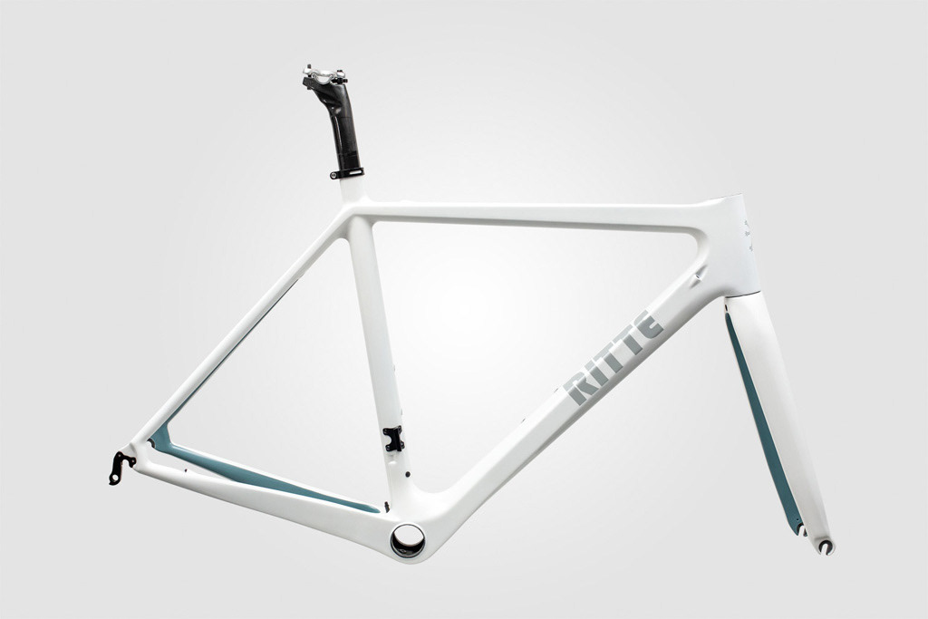
So in 2019 another executive decision was made. I treated myself to a 2015 Ritte Ace in white. A blank canvas to bring this idea to life. My own little design project.
On one of my rides back in Melbourne I stopped at the MAAP shop for a coffee. Interestingly, both brands had once teamed up together. And on display at the shop was a book covering a brief history of Ritte. A timely resource to study thoroughly. Did you know, for example, that the paint design of the Ritte Bosberg was inspired by BMC’s Astana team bike, which used both a lovely light blue and untraditional paint placement?
Some more late night browsing on the internet. In particular, on web.archive.org that allowed me to study snapshots of Ritte related sites no longer on the internet. A rather useful resource for digging further through the history of this relatively young brand in the bicycle industry.
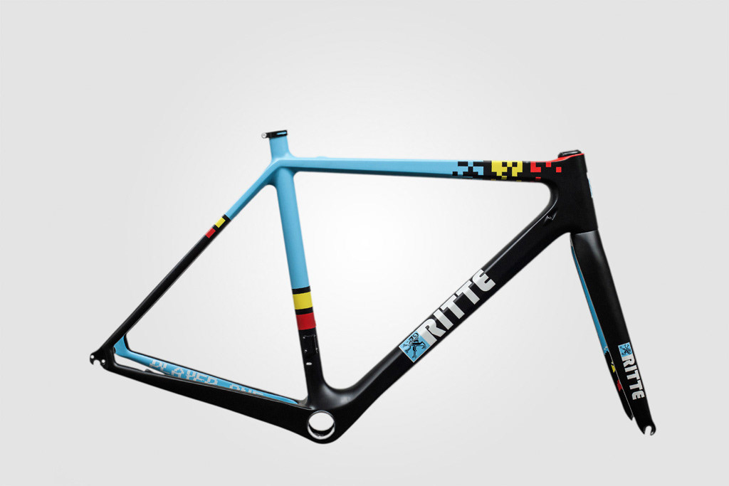
Firstly, the paint design idea would be based on the base design of the 2010 Ritte Bosberg. In particular, the inside and outside of the chainstays and seatstays, the seattube and part of the toptube. Notice those matchy-matchy bottle cages? I’ll get to those in a minute!
The toptube would incorporate the wrap as seen on the 2012 Ritte 1919 TT toptube mixed with the 2013 Ritte Vlaanderen top section of the toptube sitting on, instead of slicing, the headtube.
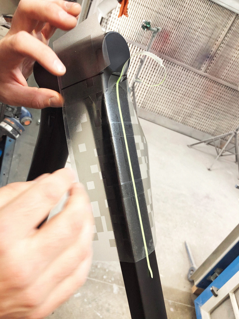
For the transition from the toptube to the headtube I decided to incorporate the pixel designs of the one-off Ritte Player One prototype and the one-off Ritte Vlaanderen for Mavic’s 125th anniversary.
These pixel designs were a common theme in the range of Ritte bicycles culminating in their 2013 8-bit cycling kit with an appropriate Pac-Man theme:
“Pac-Man is essentially the yellow jersey on a lone breakaway, relentlessly pursued by a multicolored peloton. Then, just as he’s about to be reeled in, our maillot jaune hero chomps down on a pulsing power pill left at the roadside by his soigneur who’s promised it’ll make him “strong like a bull”. Now invigorated by this fresh injection of morale, the artificially powered and obviously glowing protagonist proceeds to attack the peloton, eating any and all in his way. Now that the competition has been devoured and the road’s been cleared, he’s free to finish the stage solo.”
I decided to extend this pixel theme by concealing the Pac-Man characters on the inside of the fork. On the one side decorated with Blinky (red), Clyde (yellow) against a black background representing the colors of the Belgian flag and with Ghost integrated into the Belgian blue. And on the other side with an 8-bit cherry. All appearing on that cycling kit too.
On several of their bicycles the model name would be concealed on the inside of the chainstays. In a similar 8-bit style typeface I adopted the name of the Ritte “Player One” prototype. A reference to a book of the same name about a young man who uses his exhaustive knowledge of 80's pop culture to save the world.
Apart from Spencer Canon, several of Ritte’s one-off models would be designed and painted by PoseurSport’s Alex Ostroy, an extraordinary cycling connoisseur and creative collaborator of Ritte. Its trademark logo glitch was the finishing touch to my “Player One” logo.
The headtube would be decorated with a custom badge sharing similarities to the one seen on the 2010 Ritte Muur, 2011 Ritte Cipressa and 2011 Ritte Sallsberg. That is, the brand name in its trademark typeface on top of the logo of the Flanders lion.
Ritte’s logo has seen several different designs throughout its years. To stick to the digital theme, I decided to use the recent geometric shaped design of the Flanders lion as seen on the Ace, instead of the original one on the Bosberg or the updated one on the Vlaanderen.
Finally, the outside of the fork and the downtube would be decorated with this custom badge similar to the one seen on my Ritte Vlaanderen. That is, text next to the logo.
There’s this insightful lecture of John Cleese on creativity. Essentially, finding a time and place to play with an idea for the sole purpose of enjoyment. Surprisingly, the sketching on paper didn’t do much as most of my ideas were conceived in the shower pondering over all these images I had seen.
Although at some point play time had to be over. The next step was to put the sketches into something more serious and precise, which a painter would be able to work with.
From Pixels To Paint
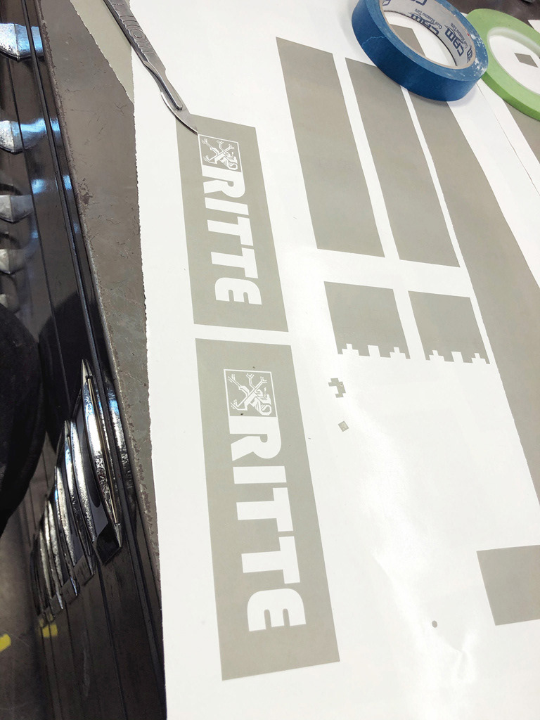
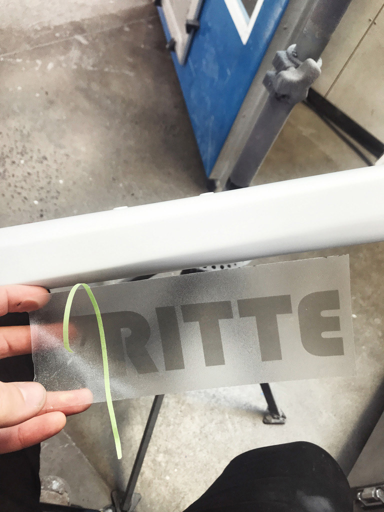
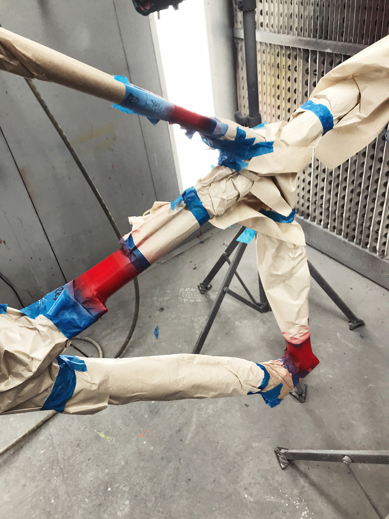
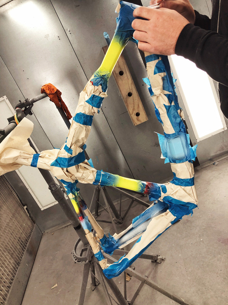
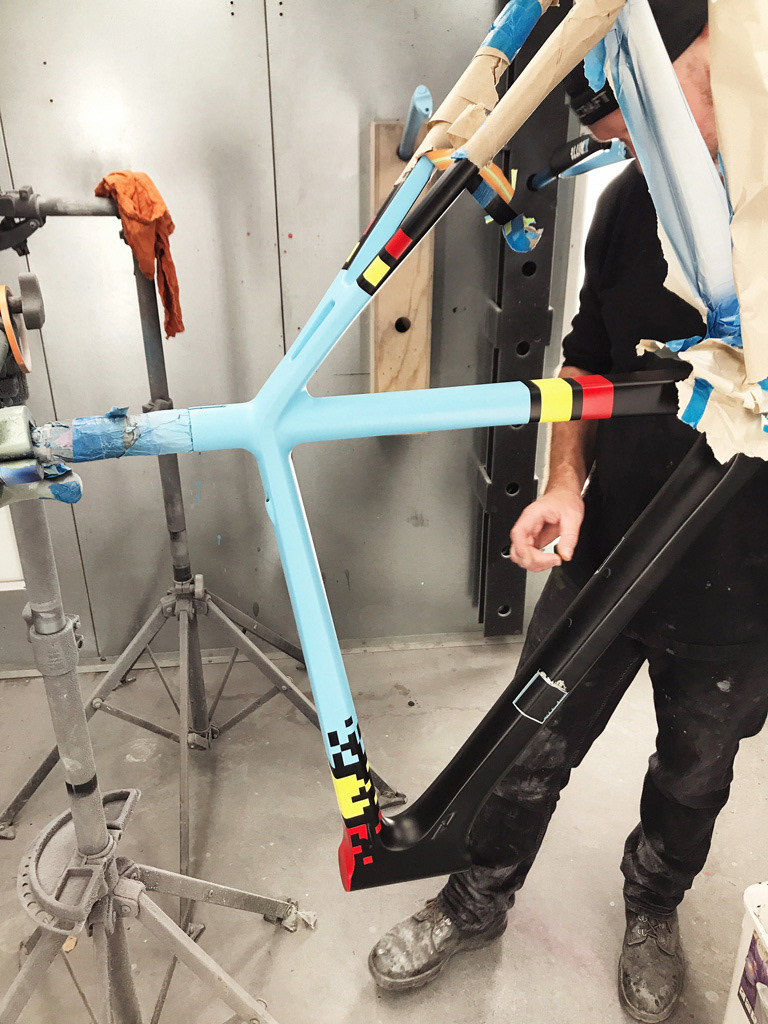
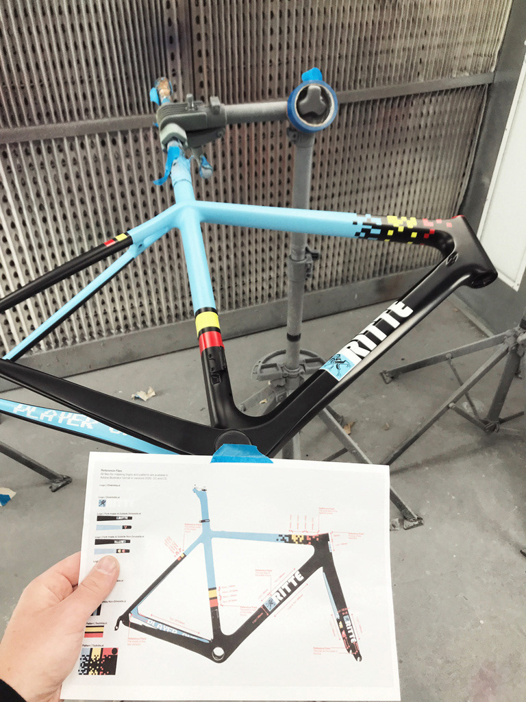
Threading a transparent fishing line through the frameset it was suspended from the ceiling in my room. And against a white wall it was rather straightforward to isolate the frameset in Photoshop to start translating the design from my sketches on paper to pixels on screen. The next step was to transfer this digital design in Photoshop to vector files in Illustrator for the painter to print masking tape for the layers of different colors of paint. And since I had no skills in Illustrator, I went on yet another crash course by binge-watching YouTube videos.
Although not having access to an actual Bosberg to precisely measure the widths of the red-black-yellow-black strips on the seatstays, seattube and toptube to stay true to the original ratios, I analysed several high resolution images of the Bosberg to work out an accurate pixel to millimeter conversion. Because the frame size was an unknown variable in these images, I could not use the frame geometry dimensions to determine this conversion. But there’s one thing that different frame sizes have in common to determine this. The distance between the bidon cage mounts, i.e. 64 millimeter. So for each and every image I was able to convert the pixels to millimeters of these strips. And a sample size of six images was sufficient to do the job within an acceptable level of accuracy. Arithmetic and spreadsheet skills required.
These vector files, I later learned, are crucial to transfer the digital design to printing painting masks to the level of my millimeter precise measurements. Now, all of this works well on a two dimensional image on a screen where the asymmetric shapes and slopes of the frameset are out of sight.
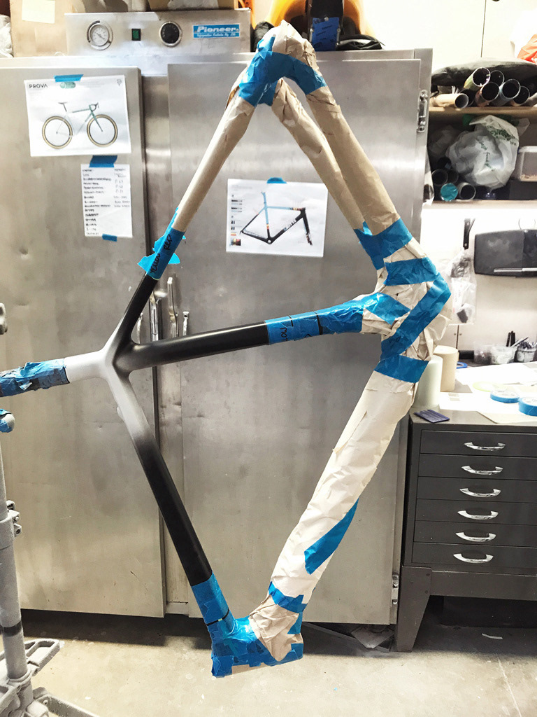
And this is where trade experts by the name of Ian Michelson from The Lost Workshop and Steve Gardner from Velocraft enter. Ian fine tuned the vector files to print painting masks that perfectly followed the frameset’s contours to the point where Ian even improved on my original design. And by bringing in my Ritte Vlaanderen Steve color matched the true Belgian blue by measuring a small section on the inside of the fork that had not been affected by any discoloration due to exposure to the sun.
Apart from these true experts helping to take the realisation of my ideas further than I had anticipated, what amazed me most was seeing the semi matte finish the final paint design was wrapped in when picking it up at the paint shop. This is difficult to describe ... trust me on this one!
Build To Ride
For this build I didn’t intend to make any mistakes as what had happened before. This meant the wise thing to do was to hand over the frameset and all components at my local bike shop Saint Cloud in Melbourne. Enter the experts by the names of Sime Doran and Nick Mahoney who went above and beyond with the build. From concealing the groupset’s electronic parts in the cockpit to inserting some of the most interesting shaped grommets in the frameset’s exposed holes. And whilst following all my personal measurements they had on file from a proper bike fit I had previously done with Ken Ballhause at Adaptive HP.
As for my decisions on the components I took a rather unconventional road for some in our community. These decisions can be characterised to soothe my strong desire to create something of unity and uniformity. Each and every component connected to one another through some sort of conceptual relationship. I’ll explain.
Firstly, for the groupset I chose Shimano’s Dura Ace for the sole reason it shared the term “Ace” to fit with the Ritte Ace. And Di2, because … have you heard the sound of the front derailleur? That’s like levelling up in a classic 8-bit arcade game! Now, deciding on Shimano’s groupset there was no other option than to choose Shimano’s PRO components (handlebar, stem, saddle and seat post clamp … and bike stand) to complement and complete a clean build as if each and every part came from the same Japanese parental nest which I would adopt, keeping the brothers and sisters together.
As for the wheelset, the soundtrack would be provided by Ritte’s long-lasting collaborators HiFi. As someone on social media pointed out on seeing a photo of the build: “Full West Coast frame and wheel combo!” On behalf of yours truly, Ritte reached out to Joshua Liberles at HiFi and brought the band back together.
As for the tyres, I once came across this gritty photo gallery of the Belgian Waffle Ride. A Belgian inspired race held in the US which was sponsored by IRC tyres. And on my travels through Japan I had come across this Japanese brand which would complement the Japanese origins of the rest of the chosen parts.
Now, remember those match-matchy bottle cages on the 2010 Ritte Bosberg? Well, for years I was on the look-out for these one-off original Ritte carbon beauties, until I finally came across a second-hand pair on eBay only weeks before the bike was built.
Finally, the bartape was sourced locally from the people at Burgh. Their pixel theme tape brought the build from the final level to completion.
And how does this conglomerate of parts perform on the road, you wonder? Well, to quote a Ritte ad from the archives:
“This is just a bicycle, not a ticket to your dreams. It’s not a romantic poem immortalised in black and white photography. It doesn’t notice if you’re suffering nobly through wind and rain or care if your ride is epic enough. But it does leap forward when you push the pedals. It dives and carves and sprints, it gives back exactly what you put in. And of course, it can also make you feel really damn awesome.”
Specifications
Frameset: Ritte Ace
Headset: FSA Carbon Integrated
Wheelset: HiFi EP Anti-Flutter 38mm Carbon Clinchers
Bottle Cages: Ritte Carbon
Bottom Bracket: Praxis PF30 68mm
Groupset: Shimano Dura Ace 9150 Di2 with 50-34T Chainring, 11-30T Cassette and 165mm Crank Arms
Pedals: Shimano Dura Ace PD-R9100 SPD-SL
Tyres: IRC Roadlite 25mm
Tubes: Schwalbe SV15 60mm Presta Valve
Saddle: PRO Stealth Stainless 142mm
Seat Post: Ritte Carbon
Seat Post Clamp: PRO Performance 34.9mm
Stem: PRO Vibe Alloy 100mm with Shimano Di2 Integration
Handlebar: PRO Vibe Alloy 400mm with Shimano Di2 Integration
Handlebar Tape: Burgh Pixel Stealth
Paint By: Velocraft in Melbourne, Australia
Build By: Saint Cloud in Melbourne, Australia